Mastering Line Weight: Why Structure Is the First Step to Stronger Drawings

What separates a decent sketch from a commanding drawing? You might assume it’s detail. Or perhaps shading. But more often than not, it’s something simpler—and more decisive: line weight.
Line weight refers to the thickness or thinness of a drawn line. At first glance, varying the weight of a line may seem like a minor adjustment, but it is one of the most powerful tools available for creating depth, focus, and intent. Without it, even a well-proportioned drawing can feel flat. With it, even a loose sketch can feel grounded and alive. Line weight does more than improve drawings. It reveals discipline. And discipline is one of the earliest signs of serious work.
Why Line Weight Matters
Line variation.
A heavier line can suggest that a form is pressing downward or shifting forward into space. A lighter one can imply distance, delicacy, or lift. The best use of line weight draws attention quietly, without drawing attention to itself. Through subtle shifts in pressure, it establishes hierarchy and rhythm, suggesting volume before the form fully resolves.
When an artist begins with faint exploratory lines, form can feel uncertain. The moment a few contours deepen with pressure, structure emerges. Nothing new has been added—only emphasis. Meaning enters through hierarchy. When every line is drawn with the same pressure, the result can feel elementary or mechanical. When variation enters, structure emerges—and structure gives work staying power.
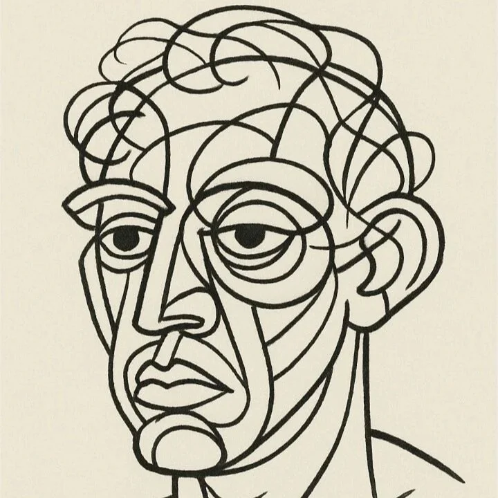
Four Artists Who Engineered Perception
Some of the clearest examples of masterful line weight can be found across radically different styles. Four artists in particular demonstrate how this deceptively simple technique shapes perception.
George Condo wields bold, elastic lines in his cubist-inspired portraits. His outlines provide gravity to compositions that might otherwise dissolve into fragmentation.
M. C. Escher used line weight with mathematical precision. In his woodcuts and lithographs, the separation of planes and the logic of space emerge through carefully controlled variation in thickness.

Albrecht Dürer.
Albrecht Dürer may be the most technically revered of them all. Hair, fur, armor, fabric—each constructed through weight rather than wash.
And Al Hirschfeld, working with almost implausible restraint, captured entire personalities through a handful of continuous lines. His mastery was evident not in excess, but in conviction.
Different eras. Different aesthetics. The same structural awareness.
How to Practice Line Weight with Simple Forms
To explore this for yourself, begin simply. Use a tool that responds to pressure—a 2B or 4B pencil, or a flexible-nib pen. Avoid rigid tools at first; they resist nuance.
Draw a basic form—a sphere, for instance—but do not shade it. Instead, vary your pressure to reflect how light would fall: darken the underside where the form turns away, and allow the lit edge to remain thin and almost disappearing. Without adding tone, the sphere will appear dimensional. That is the promise of line weight: volume and mass built from nothing more than deliberate pressure.
The principle expands naturally into complex forms. A face benefits from stronger strokes along the jaw, temples, or brow ridge—anywhere bone or flesh projects or casts shadow. Lighter marks serve the cheek, the eyelid, the subtle turn of a lip. It is not decoration. It is construction. Think of your lines as beams and supports rather than ornament.

A single shift in pressure can move a drawing from flat to full.
To refine control, try copying a master drawing using only three distinct weights—light, medium, and heavy. Eliminate shading entirely. The limitation forces observation. You begin to see how hierarchy emerges from contrast alone. Over time, the decision of where to press and where to release becomes instinctive. Your hand mirrors your eye’s sense of structure. You are no longer merely sketching; you are building.
When structure is present, the viewer senses it—even if they cannot articulate why. That felt solidity is what separates decorative work from work that earns a place in a collection.
From Sketchbook to Finished Work
In my own studio practice, line discipline evolves into edge control—deciding where a form asserts itself and where it dissolves into atmosphere. In my Rubik’s Cube compositions, it becomes value hierarchy across modular planes. In devotional works, it informs how the cross advances or recedes against the ground, whether it carries visual weight or yields to light.
The principle remains consistent: hierarchy creates presence. Presence creates authority. Authority creates longevity. And longevity is what separates passing trend from enduring work.
These are not academic concerns. They are structural ones. And structure is what allows a work to endure beyond trend or novelty. It is the difference between something that decorates a wall and something that holds its place on it.
For Collectors
You do not need to know how to draw in order to recognize structural discipline. But once you begin to see it, you cannot unsee it. When evaluating artwork, consider whether the structure feels intentional. Do the edges guide your eye with clarity? Does the composition feel anchored rather than decorative?
These questions quietly shape long-term collectability.
If you are building a considered collection and value structural discipline beneath the surface, you can explore the current selection of originals and limited editions here.
For early previews and studio notes shared before public release, you are invited to join the Collector Circle.